Pointer Gesture
Some functionalities on websites function using multi-point or path gestures. However, these functionalities CAN be inaccessible for assistive technology users. Hence, alternative solutions SHOULD be provided for them.
NOTE:
- New to accessibility or uncertain of requirements, it will be helpful to review all sections below.
- Already familiar with requirements, skip to the “Working Example” section for sample HTML, CSS and JavaScript (when needed), along with a working demo.
- Avoid using functionalities using multi-point or path gestures.
-
Alternative single-point gestures SHOULD be provided for functionalities using
multi-point or path gestures.
For example, in the case of carousels, providing carousel controls CAN act as an alternative to swipe gestures on mobile devices.
Providing multi-point or path gestures with alternative single finger gestures majorly benefit the below users.
- People using keyboard only
- People with visual impairments
- People with motor impairments
- People with limited dexterity
<!-- In the header -->
<link rel="stylesheet" href="https://cdnjs.cloudflare.com/ajax/libs/font-awesome/6.4.0/css/all.min.css"/>

<!-- In the body -->
<section class="carousel" aria-label="Featured Articles Carousel">
    <button class="previous fas fa-chevron-left" aria-label="Previous Slide"></button>
    <div class="slides" aria-live="polite">
        <div class="slide" aria-hidden="false" role="group" aria-label="slide 1 of 4">
            <div class="card reorder">
                <h2>MyLab</h2>
                <img src="/resources/developers-corner/reference-library/common-images/smiling-girl-working-with-laptop.jpeg" alt loading="lazy" width="400" height="200">
                <p>
                    Data-driven guidance to help improve results with
                    engaging, interactive content by expert authors.
                    <a href="#">Explore MyLab<sup>®</sup></a>
                </p>
            </div>
        </div>

        <div class="slide" aria-hidden="true" role="group" aria-label="slide 2 of 4">
            <div class="card reorder">
                <h2>Mastering</h2>
                <img src="/resources/developers-corner/reference-library/common-images/woman-working-with-laptop-on-couch.jpg" alt loading="lazy" width="400" height="200">
                <p>
                    Tools to help create immersive science & engineering
                    courses that increase engagement.
                    <a href="#" tabindex="-1">
                        Explore Mastering<sup>®</sup>
                    </a>
                </p>
            </div>
        </div>

        <div class="slide" aria-hidden="true" role="group" aria-label="slide 3 of 4">
            <div class="card reorder">
                <h2>Revel</h2>
                <img src="/resources/developers-corner/reference-library/common-images/woman-studying-outside.jpg" alt loading="lazy" width="400" height="200">
                <p>
                    A dynamic mobile reading experience that blends
                    digital text and media to bring concepts to life.
                    <a href="#" tabindex="-1">
                        Explore Revel<sup>®</sup>
                    </a>
                </p>
            </div>
        </div>

        <div class="slide" aria-hidden="true" role="group" aria-label="slide 4 of 4">
            <div class="card reorder">
                <h2>eTextbooks and Pearson+</h2>
                <img src="/resources/developers-corner/reference-library/common-images/woman-looking-at-cellphone.jpeg" alt loading="lazy" width="400" height="200">
                <p>
                    The engaging content digital natives need, in the
                    format they prefer, at a price point they expect.
                    <a href="#" tabindex="-1">Explore eTextbooks</a>
                </p>
            </div>
        </div>
    </div>
    <button class="next fas fa-chevron-right" aria-label="Next Slide"></button>
    <div class="navigation" role="group">
        <button class="active" aria-current="true">
            <span class="hidden">Slide 1 - MyLab</span>
        </button>
        <button><span class="hidden">Slide 2 - Mastering</span></button>
        <button><span class="hidden">Slide 3 - Revel</span></button>
        <button>
            <span class="hidden">Slide 4 - eTextbooks and Pearson+</span>
        </button>
    </div>
</section>
:root {
    --carousel-height: 30%;
    --slide-width: calc(100% / 1);
}

* { box-sizing: border-box; }

body {
    background-color: #f5f5f5;
    padding: 20px;
    font-family: 'Open Sans",', sans-serif;
}

.carousel {
    position: relative;
    width: calc(100% - 40px);
    max-width: 500px;
    height: var(--carousel-height);
    margin: 0 auto;
    padding: 0 20px;
}

.previous,
.next {
    display: flex;
    justify-content: center;
    align-items: center;
    padding: 5px 10px;
    position: absolute;
    top: calc(50% - 16px);
    cursor: pointer;
    font-size: 32px;
    border: 0;
    background: none;
}

.previous { left: -30px; }

.next { right: -30px; }

.slides {
    list-style: none;
    padding: 0;
    margin: 0;
    display: flex;
    width: 100%;
    overflow: hidden;
}

.slide {
    flex: 0 0 calc(100% / 1 - 10px);
    margin: 0 5px;
    padding: 20px;
    height: var(--carousel-height);
    display: flex;
    align-items: center;
    font-size: 16px;
    line-height: 20px;
    background-color: white;
}

@media screen and (max-width: 768px) {
    .slide {
        font-size: 14px;
        line-height: 18px;
        align-items: flex-start;
    }
}

@media only screen and (max-width: 480px) {
    :root {
        --carousel-height: 50%;
        --slide-width: 100%;
    }

    .carousel {
        width: 100%;
        padding: 0;
    }

    .previous, .next {
        top: calc(50% - 12px);
        font-size: 24px;
    }

    .previous { left: 0; }

    .next { right: 0; }

    .slides { margin: 0; }

    .slide { width: 100%; }

    .card { height: 100%; }

    img {
        max-width: 100%;
        height: auto;
    }
}

.slide a {
    color: #007a9c;
    font-weight: bold;
    text-decoration: none;
    margin-top: 1.5rem;
}

.navigation {
    position: absolute;
    left: 0;
    bottom: -40px;
    list-style: none;
    padding: 0;
    margin: 0;
    display: flex;
    justify-content: center;
    align-items: center;
    width: 100%;
}

.navigation button {
    display: inline-block;
    width: 17px;
    height: 17px;
    margin: 0 5px;
    border-radius: 50%;
    background-color: white;
    border: 3px solid #000;
    cursor: pointer;
}

.navigation button.active {
    opacity: 1;
    width: 23px;
    height: 23px;
    background-color: #000;
}

.navigation button:focus {
    outline: .15em solid #000;
    outline-offset: 1px;
}

h2 {
    font-size: 1.4rem;
    margin-top: .5em;
    margin-bottom: .2em;
    line-height: 1;
}

.cards {
    display: flex;
    flex-direction: row;
    justify-content: center;
    flex-wrap: wrap;
    list-style: none;
    margin: 0;
    padding: 0;
}

.cards > * { flex: 0 1 25em; }

.card {
    margin: .75em;
    padding: .75em;
    border-radius: 3px;
    border: 2px #ccc solid;
    border-radius: .6em;
    background-color: white;
    position: relative;
}

img {
    width: 100%;
    height: auto;
}

.reorder {
    display: flex;
    flex-direction: column;
}

.reorder img {
    max-width: 100%;
    order: -1;
}

.card > * a,
.card > .cta {
    display: block;
}

.card h2 > a {
    text-decoration: none;
    color: inherit;
}

.linkify:hover {
    cursor: pointer;
    box-shadow: 0 0 0 3px rgba(38, 50, 190, .8);
}

.cards .isfocused {
    outline: 0;
    box-shadow: 0 0 0 3px rgba(38, 50, 190, .8);
}

.isfocused a:focus { outline: none; }

.card .cta {
    text-decoration: underline;
    color: #242AC1;
    font-weight: bold;
}

.hidden {
    border: 0;
    clip: rect(0,0,0,0);
    height: 1px;
    margin: -1px;
    overflow: hidden;
    padding: 0;
    position: absolute;
    width: 1px;
}

h1 { text-align: center; }

sup {
    top: -.6em;
    position: relative;
    font-size: 75%;
    line-height: 0;
    vertical-align: baseline;
}
let previousButton, nextButton;
let slidesContainer, slides, slideDots;
let leftMostSlideIndex = 0;
let slideGap = 5;
let touchStartX = 0;
let touchEndX = 0;
let isTransitioning = false;

window.addEventListener('DOMContentLoaded', function (e) {
    previousButton = document.querySelector('.previous');
    nextButton = document.querySelector('.next');
    slidesContainer = document.querySelector('.slides');
    slides = slidesContainer.querySelectorAll('.slide');
    slideDots = document.querySelectorAll('.navigation button');
    cardlink = document.querySelectorAll('.card a');

    previousButton.addEventListener('click', previousSlide);
    nextButton.addEventListener('click', nextSlide);

    slideDots.forEach(function (dot) {
        dot.addEventListener('click', function (e) {
            goToSlide(Array.prototype.slice.call(slideDots).indexOf(e.target));
        });
    });
    slidesContainer.addEventListener('touchstart', handleTouchStart, false);
    slidesContainer.addEventListener('touchmove', handleTouchMove, false);
});

function handleTouchStart(event) {
    touchStartX = event.touches[0].clientX;
}

function handleTouchMove(event) {
    touchEndX = event.touches[0].clientX;
    handleGesture();
}

function handleGesture() {
    const touchThreshold = 50;

    if (!isTransitioning) {
        const touchDifference = touchEndX - touchStartX;
        if (touchDifference > touchThreshold) {
            if (leftMostSlideIndex > 0) {
                transitionToSlide(leftMostSlideIndex - 1);
            }
        } else if (touchDifference < -touchThreshold) {
            if (leftMostSlideIndex < slides.length - 1) {
                transitionToSlide(leftMostSlideIndex + 1);
            }
        }
    }
}

function previousSlide() {
    if (leftMostSlideIndex > 0) {
        transitionToSlide(leftMostSlideIndex - 1);
    }
}

function nextSlide() {
    if (leftMostSlideIndex < slides.length - 1) {
        transitionToSlide(leftMostSlideIndex + 1);
    }
}

function goToSlide(nextLeftMostSlideIndex) {
    if (!isTransitioning) {
        transitionToSlide(nextLeftMostSlideIndex);
    }
}

function transitionToSlide(nextLeftMostSlideIndex) {
    isTransitioning = true;
    const slideWidth = slidesContainer.offsetWidth / 1;
    const newScrollLeft = slideWidth * nextLeftMostSlideIndex;
    slidesContainer.scrollTo({
        left: newScrollLeft,
        behavior: 'smooth'
    });

    slideDots.forEach(function (dot, index) {
        if (index === nextLeftMostSlideIndex) {
            dot.classList.add('active');
            dot.setAttribute('aria-current', 'true');
        } else {
            dot.classList.remove('active');
            dot.setAttribute('aria-current', 'false');
        }
    });

    for (let i = 0; i < slides.length; i++) {
        if (i === nextLeftMostSlideIndex) {
            slides[i].setAttribute('aria-hidden', false);
            cardlink[i].removeAttribute('tabindex');
        } else {
            slides[i].setAttribute('aria-hidden', true);
            cardlink[i].setAttribute('tabindex', '-1');
        }
    }

    leftMostSlideIndex = nextLeftMostSlideIndex;
    setTimeout(function () {
        isTransitioning = false;
    }, 500);
}
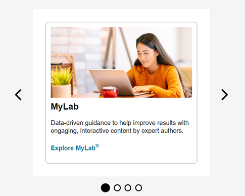
MyLab

Data-driven guidance to help improve results with engaging, interactive content by expert authors. Explore MyLab®
Mastering

Tools to help create immersive science & engineering courses that increase engagement. Explore Mastering®
Revel

A dynamic mobile reading experience that blends digital text and media to bring concepts to life. Explore Revel®
eTextbooks and Pearson+

The engaging content digital natives need, in the format they prefer, at a price point they expect. Explore eTextbooks