Forms - Input Structure

Forms are used to submit user data on websites and web applications. Forms can be simple such as a feedback form and complex such as placing an order form. It can be a simple one-page form or a multipage form.
Accessible forms make the task of inputting the information an equitable experience for people with different types of disabilities.
A well-designed form makes the experience intuitive for users while inputting the data.
NOTE:
- New to accessibility or uncertain of requirements, it will be helpful to review all sections below.
- Already familiar with requirements, skip to the “Working Example” section for sample HTML, CSS and JavaScript (when needed), along with a working demo.
In a form, order of the form control is important as the placement of the fields must make logical sense. It should not break the logical order of top to bottom and left to right.
The tabbing order MUST be also maintained in a logical way i.e., only the interactive element should receive programmatic focus as per the visual placement of the elements.

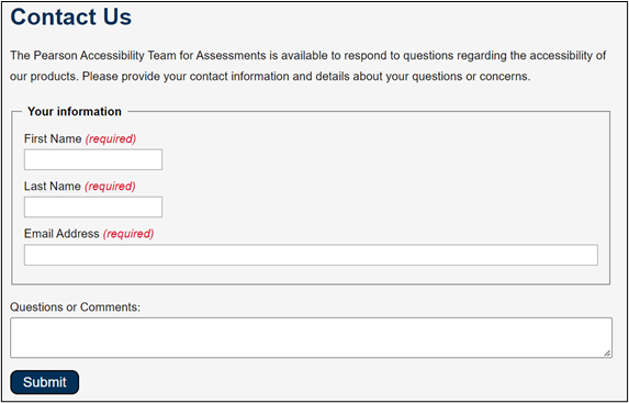
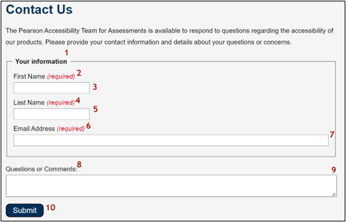
A clear indication that specific form fields are required can save users time and avoid potential errors relating to missing data when a form is submitted. Each required field MUST be semantically and visually identified as required. Such instructions MUST not be communicated through placeholder attribute.

For defining required fields using ARIA, below two attributes are useful:
-
aria-required attribute: Along with a visual identification
such as an instruction “* means required fields” at the top of the form and * placed in
the labels of the form fields about the field being required – this attribute when set to true helps
the assistive technology like screen reader to identify the field as required.
Note: If the field's label already contains the word “required”, it is recommended to leave out the aria-required attribute. This makes sure that screen readers do not read out the term “required” twice. - aria-invalid attribute: Along with the error messages that are displayed when a form is submitted with invalid data, this attribute when set to true announced the field as invalid. When the field is valid, it’s not mandatory to use aria-invalid attribute and setting the value to false – it’s just one option that can be followed.
Provide instructions to help users understand how to complete the form and use individual form controls. It is important to indicate any required input, data formats, and other relevant information at the beginning of the form so that all users can access the information.
For example, the instruction “Fields marked with * are mandatory.” placed at the top of the form informs users about the mandatory form fields.
In addition, if any required fields need any special instructions to fulfill the requirements such as phone number input field with a specific format, these instructions MUST be provided using text that is always visible. Such instructions MUST not be communicated through placeholder attribute.

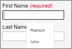
Make it easier for people to complete input fields requesting personal information. People with cognitive and motor disabilities may have difficulty in filling out forms online. Developers should use autocomplete attribute on input fields which are meant to collect personal data to explicitly identify the data type.
For example, the autocomplete attribute for fields like “First Name”, “Last Name” and “Email” can be specified with token values such as given-name, family-name, and email respectively.

To find more information on the appropriate values that can be specified for autocomplete attribute, visit https://developer.mozilla.org/en-US/docs/Web/HTML/Attributes/autocomplete .
A form with well-defined structure benefits majorly the below users.
- People with cognitive disabilities
- People using speech input
- People with limited dexterity
- People using screen readers
- People using keyboard only
<form class="auto">
    <p>
        <strong>Fields marked with asterisk (<span class="red">*</span>) are mandatory.</strong>
    </p>

    <label for="name">Full Name <span class="red">*</span></label>
    <input type="text" name="name" id="name" autocomplete="name" aria-required="true">

    <label for="email">Email <span class="red">*</span></label>
    <input type="email" id="email" autocomplete="email" name="email" aria-required="true">

    <label for="pass">Password <span class="red">*</span></label>
    <input type="password" id="pass" autocomplete="new-password" name="password" aria-required="true">

    <fieldset>
        <legend><strong>Gender</strong></legend>
        <input type="radio" name="gender" id="male" value="M">
        <label for="male">Male</label><br>
        <input type="radio" name="gender" id="female" value="F">
        <label for="female">Female</label>
    </fieldset>
    <fieldset>
        <legend><strong>Newsletter</strong></legend>
            <div>
                <input type="checkbox" name="newsletter" id="check_1" value="The weekly newsletter">
                <label for="check_1">The Weekly Newsletter</label>
            </div>
            <div>
                <input type="checkbox" name="newsletter" id="check_2" value="The Monthly newsletter">
                <label for="check_2">The Monthly Newsletter</label>
            </div>
            <div>
                <input type="checkbox" name="newsletter" id="check_3" value="The Yearly newsletter">
                <label for="check_3">The Yearly Newsletter</label>
            </div>
        </fieldset>
    <label for="comment">Comment</label>
    <textarea id="comment" name="comment"></textarea>

  <input type="submit" value="Submit">
</form>
input, textarea {
    display: block;
    margin-bottom: 0.5rem;
    padding: 0.8rem;
    border: 1px solid #8e8e8e;
    line-height: 1.15;
    width: 40%;
    border-radius: 4px;
}
label {
  font-size:1.1rem;
}
.red {
    color: #be0000;
}
.inputStructure input[type=radio] {
    display: inline;
    transform: scale(1.5);
    width: auto;
    margin-right: .25rem;
}
fieldset {
    width: 40%;
    margin: 1rem 0;
}
.inputStructure input[type=checkbox] {
    display: inline;
    transform: scale(1.5);
    width: auto;
    margin-right: .25rem;
}
input[type=submit] {
    background-color: #eff3f6;
    border: 1px solid #000;
    border-radius: 10px;
    color: #000;
    padding: 0.35rem 1rem;
    width: auto;
    margin: 0.5rem 0;
    font-size: 1rem;
    cursor: pointer;
    display: inline;
}
@media screen and (max-width: 600px) {
    .auto {
        width: 100%;
    }
    input, fieldset, textarea {
        width: 90%;
    }
}