Hover or Focus Triggers Additional Content

There are various functionalities used on webpages which appear on hover or focus such as tooltips, menus, and popups. These types of functionalities can be used for displaying more information or displaying more content in a limited space. This functionality SHOULD be accessible for all user groups.
NOTE:
- New to accessibility or uncertain of requirements, it will be helpful to review all sections below.
- Already familiar with requirements, skip to the “Working Example” section for sample HTML, CSS and JavaScript (when needed), along with a working demo.
Triggering Control
-
The triggering element MUST be defined using native controls such as
<button>,<a>,<input>and so on. -
A descriptive and programmatic label MUST be provided for the triggering control
using native approach or using
aria-labelattribute or hidden off-screen text. - If an image is used to identify the triggering control, then a textual description MUST be defined for the image triggering control. For more information, refer to the Images component.
- It is triggered when the control receives keyboard focus, or the user hovers the mouse over it.
- The additional information that appears MUST be hoverable i.e., when users shift their mouse pointer from triggering element to the information, it should remain persistent and not disappear.
- Content usually appears after a small delay and disappears when Escape is pressed or by clicking in the whitespace area of the page.
- Additional content SHOULD NOT get dismissed on mouse out or losing focus.
- If the additional content that is displayed contains multiple focusable elements, it SHOULD be implemented as a non-modal dialog instead.
- The image/icon of the triggering control SHOULD NOT be defined through CSS background-image property.
- The triggering control MUST be visible in High Contrast Mode.
- There SHOULD be a clear visual focus indication provided for the triggering control that displays the additional content. For more information, refer to Focus Indicator component.
- Focus MUST NOT update to the additional content that appears on interacting with the triggering control.
- To meet the color requirement, refer to Color Alone and Color Contrast components. For example, the contrast requirement of 3:1 ratio MUST be met with the adjacent colors for the custom focus indicator of the triggering control.
- A mechanism SHOULD be provided to dismiss the additional content without removing hovering or focusing unless the additional content displays an error message or does not hide surrounding content.
- On triggering the additional content, the pointer CAN be moved over the additional content without it getting dismissed.
- The additional content SHOULD remain visible until users dismiss the content, the hover or focus is removed, or the information is no longer needed.
More information on meeting accessibility requirements, for components like Menu/Menu Button and Tooltips, refer Tooltips and Toggletips along with Menu and Menu Button components.
For example,
<div class="tooltip">
    <span id="business">Assessment Business</span>
        <!-- Tooltip Control -->
    <button class="tooltip_btn" id="tooltip_btn" type="button" aria-label="More Info" aria-describedby="business assessments-business">i</button>
        <!-- Tooltip Container -->
    <span role="tooltip" class="tooltiptext" id="assessments-business" style="display: none;">
        Pearson is the world's leading learning company with expertise in a variety of assessments.
    </span>
</div>
A well-defined additional content displayed on hover or focus majorly benefit the below users.
- People with cognitive disabilities
- People with visual disabilities
- People using keyboard only
- People with limited dexterity
<link rel="stylesheet" href="https://cdnjs.cloudflare.com/ajax/libs/font-awesome/6.4.0/css/all.min.css"/>
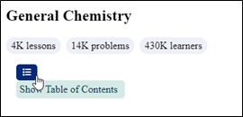
<h2>General Chemistry</h2>
<div class="elLdu7">
    <div class="sN0kd9">4K lessons</div>
    <div class="sN0kd9">14K problems</div>
    <div class="sN0kd9">430K learners</div></div>
<div class="tooltip" id="tooltip">
    <button class="tooltip-button" id="tooltipButton" type="button" aria-labelledby="table-content">
        <i class="fas fa-list"></i>
    </button>
    <span role="tooltip" class="tooltiptext" id="table-content">Show Table of Contents</span>
</div>
<div id="tableOfContents" class="hidden">
    <h2>Table of Contents</h2>
    <ol>
        <li>Intro to General Chemistry</li>
        <li>Atoms & Elements</li>
        <li>Chemical Reactions</li>
        <li>BONUS: Lab Techniques and Procedures</li>
        <li>BONUS: Mathematical Operations and Functions</li>
        <li>Chemical Quantities & Aqueous Reactions</li>
        <li>Gases</li>
        <li>Thermochemistry</li>
        <li>Quantum Mechanics</li>
        <li>Quantum Mechanics</li>
    </ol>
</div>
.tooltip {
    position: relative;
    display: inline-block;
    margin: 1rem;
}

.tooltip-button {
    background-color: #052a77;
    color: #fff;
    padding: 5px 10px;
    border: none;
    border-radius: 5px;
    cursor: pointer;
}

.tooltiptext {
    position: absolute;
    top: 100%;
    left: 0;
    background-color: #d4eae4;
    color: #003057;
    padding: 5px;
    width: 10rem;
    border-radius: 5px;
    display: none;
}

.tooltip:hover .tooltiptext {
    display: block;
}

.hidden {
    display: none;
}
.elLdu7 {
    margin-top: 16px;
    display: flex;
    flex-wrap: wrap;
    align-items: center;
    gap: 8px;
}
.sN0kd9 {
    display: flex;
    padding: 4px 8px;
    border-radius: 30px;
    background: rgba(150,162,205,.16);
    font-family: TT Commons;
    font-size: 1rem;
    font-weight: 400;
    line-height: 18px;
}
button:focus {
    outline: .10em solid #000000;
    outline-offset: 1px;
}
const tooltipButton = document.getElementById("tooltipButton");
const icon = tooltipButton.querySelector("i");
const tooltipText = document.getElementById("table-content");
const tableOfContents = document.getElementById("tableOfContents");

let isTableOfContentsVisible = false;

const toggleTableOfContents = () => {
    if (isTableOfContentsVisible) {
        icon.classList.remove("fa-arrow-left");
        icon.classList.add("fa-list");
        tooltipText.innerText = "Show Table of Contents";
        tableOfContents.classList.add("hidden");
    } else {
        icon.classList.remove("fa-list");
        icon.classList.add("fa-arrow-left");
        tooltipText.innerText = "Hide Table of Contents";
        tableOfContents.classList.remove("hidden");
    }
    isTableOfContentsVisible = !isTableOfContentsVisible;
};

tooltipButton.addEventListener("click", toggleTableOfContents);

tooltipButton.addEventListener("mouseenter", () => {
    tooltipText.style.display = "block";
});

tooltipButton.addEventListener("mouseleave", () => {
    tooltipText.style.display = "none";
});
tooltipButton.addEventListener('keydown', function(e) {
    if (event.key === 'Escape') {
        tooltipText.style.display = 'none';
    }
});
tooltipText.addEventListener('mouseenter', () => {
    tooltipText.style.display = 'inline-block';
});

tooltipText.addEventListener('mouseleave', () => {
    tooltipText.style.display = 'none';
});
tooltipButton.addEventListener("focus", () => {
    tooltipText.style.display = "block";
});

tooltipButton.addEventListener("blur", () => {
    tooltipText.style.display = "none";
});
General Chemistry
4K lessons
14K problems
430K learners
Show Table of Contents
Table of Contents
- Intro to General Chemistry
- Atoms & Elements
- Chemical Reactions
- BONUS: Lab Techniques and Procedures
- BONUS: Mathematical Operations and Functions
- Chemical Quantities & Aqueous Reactions
- Gases
- Thermochemistry
- Quantum Mechanics
- Quantum Mechanics